


Home & Hub screens
I helped set up a digital production team and processes, delivered a complete site redesign while also implementing the foundation building blocks of Pearson's first Design System, through to build and site go-live in less than 3 months.
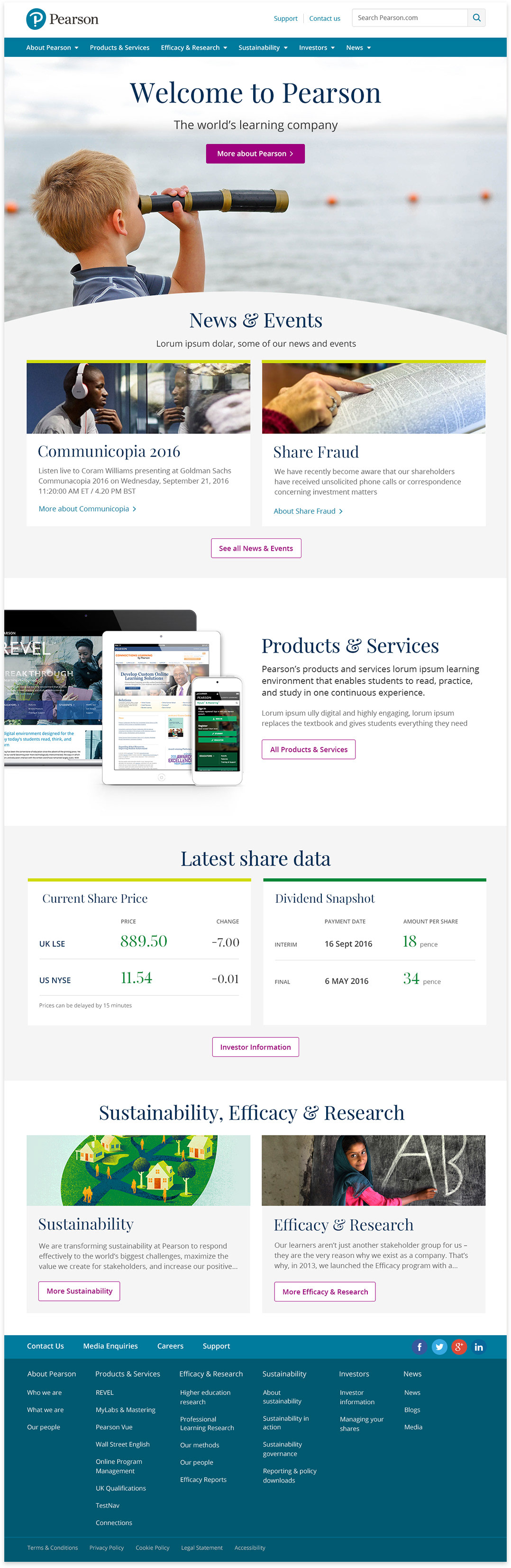
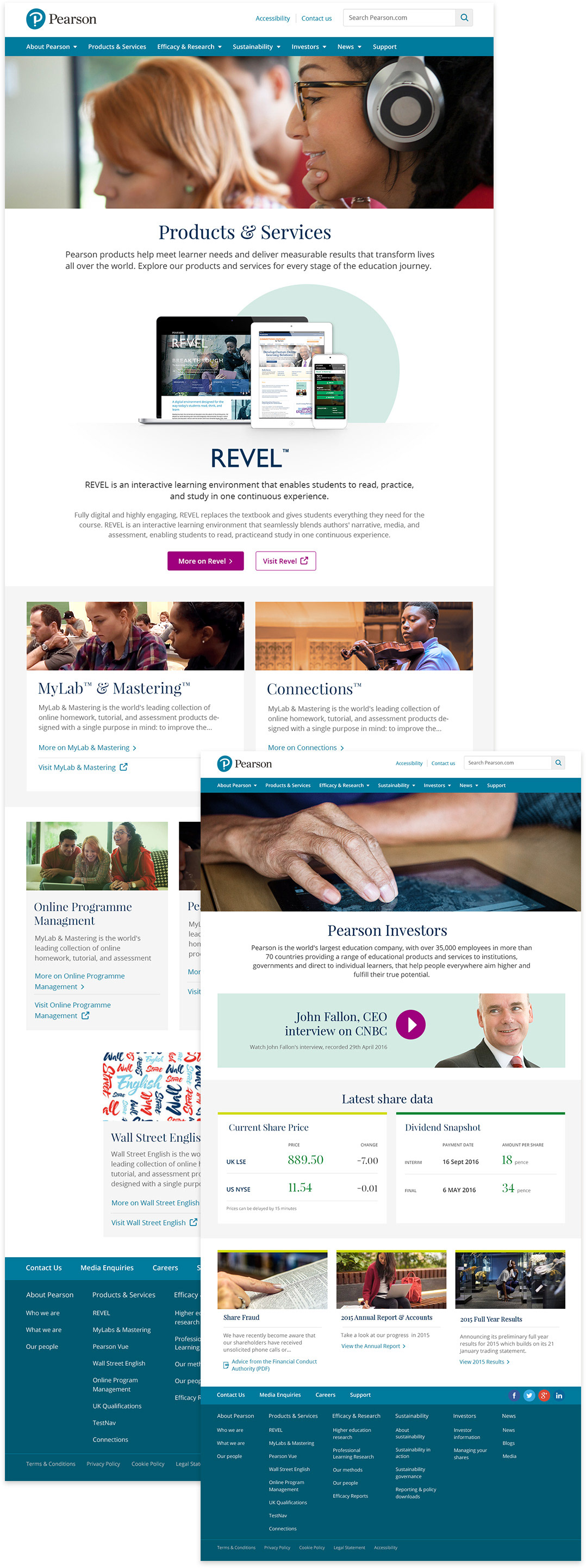

All designed responsively
We set and worked to a grid based on 320 / 768 / 1280px viewports. You can see below how the Home page responds and adapts between the 3 breakpoints.


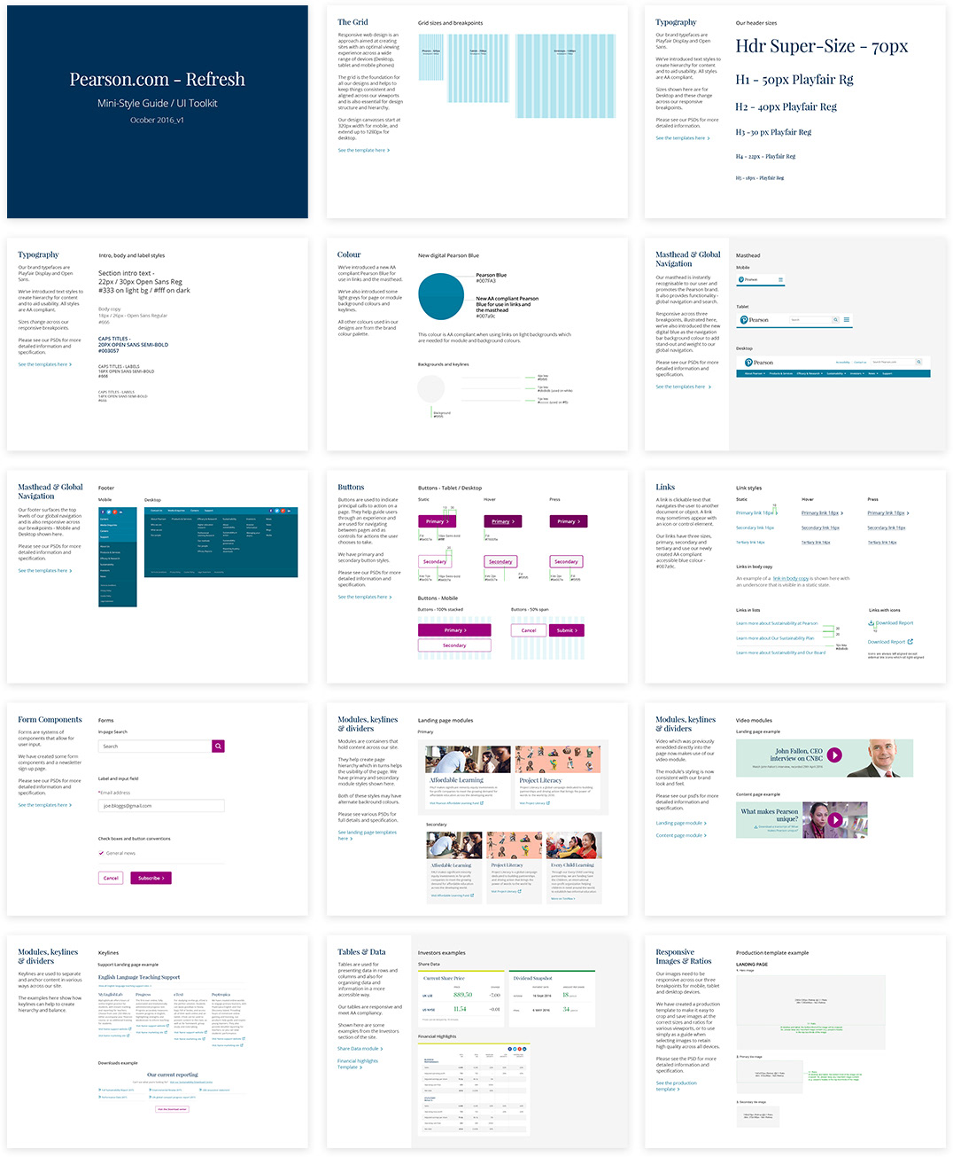
Interim Style guide
I put together an interim style guide covering all of the new design, styles, elements and components for the US and UK teams.

Project summary:
I was responsible for -
• Setting up the OneDotCom digital design approach
• Implementing efficient digital design production processes and documenting this
• Creating the building-blocks of the Pearson Digital Design Language / Design System
• Creating the building-blocks of the Pearson Digital Design Language / Design System
Including:
Responsive Grid templates + breakpoints / Page template types / Header and footer styles / Font styling and hierarchy / Module types and variants / Button and link styles and conventions / Form styles and components / Making everything accessible - AA compliant / A Style Guide covering all of the above / Plus large areas of UX design
